Take a look at any modern Indian streetwear brand today—whether it’s VegNonVeg, Jaywalking, Blue-Tyga, or premium indie labels spotted across Hauz Khas or Bandra. You’ll notice a massive, unmissable shift in how apparel is engineered. We are discussing T-Shirt Back Graphic Design Layout Placement
Gone are the days when a massive, brightly colored graphic was plastered right across the chest. Today, if you walk into any high-end sneaker boutique or scroll through trendy fashion reels, the formula has completely flipped.
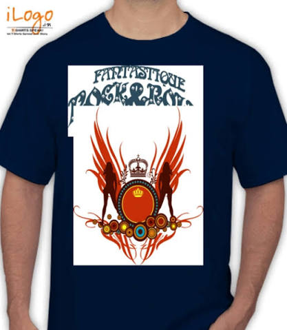
The modern aesthetic is clear: An ultra-minimalist, clean chest design paired with a massive, loud, show-stopping poster-style graphic across the back.
This isn’t just a passing fad; it is a structural revolution in the global and Indian apparel scenes driven by the explosive rise of drop-shoulder, oversized silhouettes. For independent graphic designers, clothing brand owners, and print-on-demand (POD) creators, this shift presents a massive opportunity.
However, mastering this look isn’t as simple as dragging an image asset to the back of your canvas file. The absolute biggest reason young clothing startups fail their quality checks or get negative customer reviews comes down to a technical failure: incorrect t-shirt back graphic design layout placement.
When your alignment is off by even an inch, or your print file sizing scales poorly across various garment sizes, the premium streetwear vibe instantly transforms into a cheap, awkward mistake.
In this comprehensive, best-in-class blueprint, we will unpack the exact mechanics behind the back-print trend, detail the perfect print sizing frameworks, and provide a concrete layout strategy to keep your front and back designs in flawless visual harmony.
The Back-Print Revolution: Why Graphics Moved from Chest to Spine
To build high-converting apparel merchandise, you must understand the psychology behind why consumer tastes have flipped. What is T-Shirt Back Graphic Design Layout Placement ? Why are young Indian shoppers willing to spend premium prices on a t-shirt where the front is almost completely blank?
1. The Rise of the Walking Canvas Aesthetic
When a person wears an oversized, drop-shoulder t-shirt, the fabric hangs loosely off the shoulders, creating a broad, flat, uninterrupted expanse of cloth across the shoulder blades. This area acts exactly like an art gallery canvas.
A heavy back print turns the wearer into a walking billboard for your brand’s art style, capturing the attention of everyone walking behind them in a crowd, at a music festival, or on a college campus.
2. The Clean-Front Versatility Factor
Plastering a massive, sweaty plastic-feeling print directly over the chest can make a garment stiff, uncomfortable, and difficult to style.
By shifting the heavy graphic ink to the back and keeping the front minimal, the t-shirt stays breathable and retains its luxurious drape. It allows the customer to easily layer the t-shirt under open shirts, denim jackets, or zip-up hoodies without hiding the core identity of the artwork.
Old School Layout: Massive, sweaty chest print ➔ Restricts movement & feels cheap
Modern Streetwear Layout: Clean pocket logo + Massive poster-style back print ➔ Premium drape
Sizing Frameworks: The Exact Dimensions for the Perfect Back Drop
The single most common mistake designers make is sending a generic square image file to their fabric printers without specifying exact printing dimensions. If you leave it up to the printing house, they will often default to standard chest dimensions, leaving your back print looking awkwardly tiny and lost on an oversized blank.
To clear up this confusion, let’s map out the definitive sizing frameworks used by premium apparel manufacturers.

The Gold Standard: The $A3$ and $A3+$ Print Matrix
For a back graphic to carry that heavy, high-end streetwear weight, it needs to dominate the top two-thirds of the t-shirt’s back panel. In the printing industry, this is achieved by referencing standard international paper sizing layouts as your absolute baseline frame.
- Standard $A3$ Size ($29.7 \times 42.0\text{ cm}$ / $11.7 \times 16.5\text{ inches}$): This is the ideal baseline dimension for medium, large, and extra-large streetwear blanks. It is wide enough to stretch across the shoulder blades and long enough to reach down past the mid-back line. Most direct-to-garment (DTG) and screen-printing machines handle $A3$ frames natively without incurring custom setup fees.
- Oversized $A3+$ Size ($32.9 \times 48.3\text{ cm}$ / $13 \times 19\text{ inches}$): If you are manufacturing trendy boxy-fit drop-shoulder garments (where the width of the shirt is intentionally wide), a standard $A3$ print can sometimes end up looking too narrow. Moving up to an $A3+$ scale ensures the design stays well-proportioned, stretching beautifully across wider panels.
The Vertical Sizing Scale
To ensure your layout placement is mathematically sound across varying production parameters, use this targeted dimension breakdown:
| Target Garment Style | Recommended Print Size Dimensions | Ideal Vertical Placement Offset from Neck Seam |
| Standard Slim/Regular Fit | $A3$ Max ($29.7 \times 42\text{ cm}$) | 2 inches to 2.5 inches below the collar rib |
| Oversized / Drop-Shoulder | $A3+$ Wide ($33 \times 48\text{ cm}$) | 3 inches to 3.5 inches below the collar rib |
| Cropped Boxy Fit (Women’s) | Square Format ($30 \times 30\text{ cm}$) | 2 inches below the collar rib |
Placement Blueprints: The Step-by-Step Alignment Process
Now, let’s look at how to position your graphic on the actual fabric panel. If you position a back print too high, it rides up into the neck collar and looks distorted when the wearer moves. If you place it too low, it dips below the waistline, looking sloppy and out of proportion.
Follow this strict step-by-step alignment process to lock in your design files flawlessly:
1.Establish Your Center Vertical Alignment Axis:Software Setup.
Open your vector workspace (Adobe Illustrator or CorelDraw). Draw a perfectly centered vertical guide line cutting directly through your t-shirt mockup panel. Your graphic’s exact center mass must align with this line to prevent the print from tilting toward one side of the spine.
2.Measure the Collar Rib Clearance Margin:Collar Measurement.
Never start a back print directly below the neck line. For a clean look, measure a clearance offset gap down from the bottom edge of the collar ribbing. For standard fits, this gap is 2 to 2.5 inches. For trendy oversized streetwear drops, increase this gap to 3 to 3.5 inches to account for the natural rear slope of a dropped shoulder seam.
3.Anchor the Primary Focal Point of the Artwork:Visual Center Lock.
Identify the optical center of your graphic artwork (the element where the eye lands first, like a character’s eyes or a central text block). Ensure this focal point sits squarely across the upper shoulder blade region, rather than directly between the lower ribs. This keeps the design dynamic and readable even when the wearer is sitting down.
4.Apply the 70% Width Safety Constraint Rule:Size Scaling Check.
To prevent your design from wrapping awkwardly around the sides of the body into the armpits, apply the 70% boundary rule. Ensure the maximum width of your back print file never exceeds 70% of the total flat width of the smallest t-shirt size in your production run.
Visual Balance: Coordinating the Minimalist Front Layout
A massive, bold back print demands a quiet, complementary counter-balance on the front panel. If your front design is too complex, it clashes heavily with the back art, making the overall garment look messy, disorganized, and visually overwhelming.
To achieve that premium, intentional look, structure your front placement around these three classic minimalist design layouts:
1. The Classic Left-Chest Pocket Alignment
This is the absolute gold standard for streetwear design. It keeps the front extremely clean while adding a professional, curated touch to the brand identity.
- Sizing Boundary: Keep the design contained within a strict $3.5 \times 3.5\text{ inch}$ to $4 \times 4\text{ inch}$ box.
- Placement Hack: Draw an imaginary vertical line straight down from the inner intersection where the left shoulder seam meets the neck collar line. Next, draw an imaginary horizontal line across from the center of the armpit seam. The intersection point of these two paths is the perfect center position for your left-chest logo print.
2. The Minimalist High-Center Neck Micro Text
If you want to move away from the traditional left-chest logo style, placing a tiny, elegant piece of typography right in the center of the chest is an exceptional alternative.
- Sizing Boundary: Keep the text height incredibly sleek—ideally between 0.5 inches to 1 inch max, spanning no wider than 5 to 6 inches horizontally.
- Placement Hack: Position this text exactly 1.5 inches to 2 inches directly below the center front collar rib. This draws attention upward toward the face and leaves the rest of the chest panel perfectly clean.
3. The Industrial Off-Center Right Hem Placement
For a more avant-garde, structural streetwear look, skip the chest entirely. Position a small, technical text block, barcode asset, or woven brand tag right at the bottom edge of the front panel.
- Sizing Boundary: Keep it compact, roughly $2 \times 3\text{ inches}$.
- Placement Hack: Place it roughly 1.5 inches above the bottom hem line, shifted all the way to the far bottom-right corner of the t-shirt body.
Production Pro-Tips: Avoiding the “Sweat-Patch” Disaster
Before you hit the print button and send your batches into mass manufacturing, you need to consider how the weight of the ink interacts with the physical fabric. Plastering a massive, solid block of ink on the back of a shirt can create an uncomfortable trap for body heat.
Keep these production parameters in mind to ensure your back-print drops feel as premium as they look:
Avoid Giant, Solid Vector Shapes
If your artwork features a massive, solid 12-inch circle or a solid square box filled completely with color, it will create a thick layer of rubbery ink on the shirt.
In humid climates like Mumbai, Chennai, or Delhi, this acts like a plastic sheet trapped against the skin, blocking airflow and causing uncomfortable sweat marks. Instead, break up large shapes by adding distressed textures, incorporating negative space cut-outs, or utilizing stipple-dot art styles to let the fabric breathe.
Pick the Right Print Technology
The printing method you choose plays a huge role in how the garment drapes and feels:
- Direct-to-Film (DTF): Excellent for bright colors and complex gradients, but it applies a distinct layer on top of the fabric. Use this for smaller illustrations or designs with plenty of negative space.
- Screen Printing (Plastisol Inks): Highly durable and cost-effective for bulk manufacturing, but can feel heavy if applied in thick coats. Request a high-mesh screen count for a softer feel.
- Discharge Printing / Water-Based Inks: The ultimate premium option for dark cotton garments. These inks bleach and dye the actual fabric threads instead of sitting on top of them, resulting in a print that feels completely weightless and breathable from day one.
Execute with Perfection
The back-print trend is one of the most powerful aesthetics driving modern street fashion in India today. By moving past old-school chest graphics and embracing an intentional, clean-front, poster-back approach, you give your apparel line an instantly elevated look.
Just remember: great art means nothing if the technical execution falls short. Stick closely to the $A3$ dimension frameworks, use the neck collar clearance offsets to guide your vertical placement, and leave plenty of negative space in your graphics to keep the fabric light and breathable.
Open your design canvas, load up your collection tech packs, lock in these alignment rules, and launch your next bestselling apparel drop with total confidence!
See Also
T-shirt design placement guide
DTF vs DTG Printing Cost in India: The Ultimate Reality Check for Your T-Shirt Brand